[Werkeltisch] #143 – feathers

Header Werkeltisch

please scroll down for english version :)

Uhm jah. Mal ’ne simple OneLayer-Karte. Ich wollte die Federn von The Alleyway Stamps nochmal benutzen, mir hat auf dieser Karte der Hintergrund so gut gefallen. Außerdem wollte ich schauen, ob ich ein regelmäßigeres Muster damit hinbekomme.

Karte "feathers" mit The Alleyway Stamps und Faber Castell | fraeulein-nebel.org

Mittendrin habe ich mir dann überlegt, dass ich keine Lust auf Knallfarben habe. Und bin eher bei den Erdtönen geblieben. Für einen Text konnte ich mich auch nicht entscheiden, also habe ich ihn weggelassen – alles in allem eine sehr „unentschlossene“ Karte. Ergebnis gefällt mir aber gut und ich könnte mir vorstellen, dass man das Teil sehr variabel einsetzen kann. :)
Zum Colorieren habe ich wieder die Aquarell-Buntstifte bemüht und mit einem Wassertankpinsel vermalt.
Das Muster ist tatsächlich ordentlicher geworden als bei der letzten Karte, trotzdem waren mir die Lücken noch zu groß. Im Stempelset gibt es aber – möglicherweise genau für diese Fälle! ;) – ein paar kleinere Elemente, die man als Füller nutzen kann. Schaut man in eure Sets, kleine Punkte, Herzchen, Sterne.. die kann man super verwenden bei sowas.

___________________________________________

Uhm yeah – this is a very simple one layer card. I wanted to re-use the feathers from The Alleyway Stamps because I liked this card’s background a lot. I also wanted to try to get a more even spacing between the feathers.
While working on the card, I decided that I did not feel like using bright colours again and instead used more earthy tones. I could not decide on a sentiment, so I did not use one at all. I still like the card and I can use it for different occasions since I’m not bound on a sentiment.
I used some aqaurell crayons to colour in the feathers. And because the spacing was still not good enough, I used some of the smaller elements in the stamp set to fill in the gaps. Check your sets, you can find lots of small stamps like hearts, dots or stars to balance your spacing.

Material

Papier: SU! „honiggelb“
Tinte & Farben: Versafine „onyx black“, schwarzer Permanentmarker, Faber Castell Aquarellstifte „ART GRIP AQUARELLE“
Stempel: The Alleyway Stamps „tickle me happy“
Stanzen:
Sonstiges: Falzbein, Fiskars Schneidbrett, Wassertankpinsel, MISTI

[Werkeltisch] #142 – „hello“ mit Rosen

Header Werkeltisch

please scroll down for english version :)
Oh my, mal eine Karte, die ich richtig richtig riiiichtig gerne mag. :eek: Und ich bin eine Faulette und schreibe ewig keinen Post dazu. Nuja.
Die Rosen lagen schon etwas länger bei mir rum – die wollte ich nämlich ursprünglich auf der Karte für meine Mutter verwenden. Aber.. naja, wollte irgendwie nicht, weil mir DIESE Idee gefehlt hat.

Karte "

Erstmal Gold auf die weiße Base spritzen. GEBT MIR GOLD! Ich bin ganz furchtbar, die Ulli hat mich voll angesteckt mit ihrer Goldsucht.
Dafür habe ich ein Sprühfläschchen mit goldenem Schimmer genommen, Pinsel rein und losgetropft. Liebe. :eek:

Die Rosen stammen aus dem Hause „Simon Says Stamp“, aus einem älteren Set. Sie wurden auf Aquarellpapier gestempelt, weiß embosst und dann mit Distress Ink gefärbt. Pro Tipp dabei: Falls ihr Farbe auf den embossten Teil bekommt, keine Panik. Das kann man erfahrungsgemäß einfach mit einem Tuch abreiben, wenn die Chose getrocknet ist. Die Blätter sind genauso gemacht.
Damit die Blümchen nicht so flach wirken, habe ich die verschiedenen Ebenen auseinander geschnitten; bei Ebene 1 und 2 ging das noch easy mit der Schere, für den fuppeligen Teil in der Mitte musste ein Skalpell herhalten. Mit Abstandsklebepads habe ich die Rosen wieder zusammengesetzt – tadaa! Als krönenden Abschluss hat die Elster in mir die fertigen Teile noch mit einem „Wink of Stella“ in transparent zum glimmern gebracht. :D
Arrangieren, kleben, fertig.

Der Textstempel ist von Altenew und wurde insgesamt dreimal mit dem MISTI gestempelt. Irgendwie hatte ich ’nen Lauf und war nicht fähig, meinen Stempel ordentlich zu färben – dafür liebe ich mein MISTI. Einfach nochmal eintinten und auf die selbe Stelle stempeln.. und plötzlich ist der versaute Schriftzug perfekt.
Einen weißen Rand als Accent drumrum habe ich stehen lassen, Goldfaden drunter.. auch fertig. Den Goldfaden wickel ich mir übrigens um zwei Finger, damit ich halbwegs ordentliche Schlaufen zum Arbeiten habe.

Noch nich genug Gold! Und das schwarz im Textteil so alleine!
Die Vorderseite meiner Karte habe ich kurzentschlossen ein wenig schmaler geschnitten. Im Innenteil habe ich dann einen Streifen schwarz/weißes Papier aufgeklebt, ebenso wie einen Streifen Goldpapier. :eek: Wenn die Karte jetzt geschlossen vor einem liegt, sieht es aus, als wäre der Dekoteil außen; man öffnet die Karte und hat einen kurzen Aha-Moment, weil.. ist eben nicht so. ;) Schlägt zwei Fliegen mit einer Klappe, den Innenteil meiner Karten vernachlässige ich sträflich.

___________________________________________

This is one of the few cards I really like. Like very much. And it took me ages to write the blog post – buh!
The roses were lying on my desk for quite some time now; originally I wanted to use them on a card I made for my mother.

First things first – I wanted some gold on my white cardbase. I took a bottle of shimmer spritz, dipped my brush in it and started dotting colour. I just love the gold. :eek: (That’s my friend Ulli’s fault – she’s so much into gold.)

The roses come from an older stamp set from Simon Says Stamp. I stamped them on aquarell paper, heat embossed flowers and leaves in white and added colour with Distress Inks. By the way – if you get Distress Ink on the white embossed parts, don’t panic. Usually you can just wipe the colour off with a dry cloth after the ink has dried.
To get more dimension onto my card I cut apart the different flower layers. That was easy for the first and second layer but I had to use a scalpel to cut the tiny last layer. 3D foam brought the whole flower back together – and now look at the dimension! :D To finish things off I added some clear „Wink of Stella“ glitter pen. Arranging the cluster, glueing it in place – done.

For my sentiment I used a stamp from Altenew and I kinda had bad luck with it. I had to ink it up three times to get a good impression. Good thing I own a MISTI stamping tool! I just stamped a few times in the same spot and suddenly my messed up piece looked really good. Yay for MISTI! :D
I left a thin white border around my sentiment and added some gold thread under it.

MORE GOLD PLS! And the poor black sentiment was the only black thing in the whole card – I did not like that at all.
I added some b/w stripped paper and some gold foiled paper on the inside of my card; I just cut away a piece of the front to make it more narrow. This killed two birds with one stone – I added some interest to balance the card and I decorated the inside of my card. I tend to forget the insides and just write my messages there – but it’s so cool to open up a card and find the inside matching the front. :)

Material

Papier: Papertrey Ink „white“, Aquarellpapier, Druckerpapier
Tinte & Farben: Hero Arts Metallic Shimmer „gold“, Ranger Distress Ink „picked rasberry“, „abandoned coral“, „festive berries“, „evergreen bough“, „cracked pistachio“, „black soot“, Versamark Ink, Versafine „onyx black“, Toner (Laserdrucker), Wink of Stella „clear“
Stempel: Altenew „label love“, SSS „best mom ever“
Stanzen:
Sonstiges: Falzbein, Fiskars Schneidbrett, Papierschere, HeroArts Embossingpulver „white“, SSS Stencil „diagonal stripe“, ThermOWeb Decofolie “gold”, Laserdrucker, Laminiergerät, Pinsel & Wasserglas, dm Paradies Kleberoller, Mini Gluedots, Goldfaden, MISTI

[Werkeltisch] #141 – the lion king

Header Werkeltisch

please scroll down for english version :)

Meine Stempelkisten sind ziemlich voll. So voll mit allen möglichen Motiven, dass ich zwischendurch einen riesengroßen Batzen aussortiere und verkaufe, weil der Haufen Stempel zu groß zum benutzen geworden ist.
Letztens kam ein Auftrag von einem guten Bekannten: „Mach mal was mit Löwen, ich will Musical-Karten verschenken!“
… mein Haufen Stempel beinhaltet drölfzig Blumen, Eulen, Katzen, Schafe, noch mehr Eulen, ein paar Igel, Hasen, Blumen, Wolken, Text, Blumen.. aber keine Löwen. Hilfe! (Zum Glück hatte ich nicht gerade Löwen-Stempel aussortiert, ich hätte mir so in den A**** gebissen!)

Nu gut. Shops durchgesucht und gleichzeitig meine Leute bei facebook um Rat gefragt, weil Löwe ist eben nicht gleich Löwe. Die liebe Jessa hat mir schließlich den oben fast gebissenen Popo gerettet und mir nicht nur ein wunderschönes Set vorgeschlagen, sondern gleich ein paar Abdrücke geschickt.
An dieser Stelle nochmal ein dickes Danke, liebe Jessa! Ohne dich hätte das nicht funktioniert. :eek:

Karte "the lion king" mit ReverseConfetti und Ranger | fraeulein-nebel.org

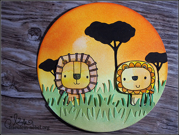
Löwen also. Gestempelt hat Jessa die auf Aquarellpapier, ich musste also nur noch colorieren. Habe ich getan, mit Distress Ink in ganz vielen Gelbtönen. Man kann sehr lange mit sehr vielen Farben an einem einzelnen Löwen malen, bis einem die Schattierungen gefallen! ;) Die fertigen Löwen wurden ausgeschnitten und, damit es fertiger aussieht, die Schnittkanten mit einem schwarzen Marker bemalt.

An dieser Stelle kam mir der Gedanke an eine Runde Karte – weil „circle of life“, ihr wisst schon. Keine Ahnung, ich habe manchmal komische Ideen. Umgesetzt, Kreis geschnitten und in gelb/orange/Sonnenuntergangsfarben eingetintet. Der helle Fleck im Hintergrund, der mit viel gutem Willen eine Sonne sein darf.. war ein Unfall mit nassem Blend-Schwämmchen. Sieht aus wie gewollt, gell? ;) Die Grasreihen wurden mit der BigShot gestanzt und ebenfalls ein bisschen mit Tinte bearbeitet, damit die Farben ein wenig variieren.

Im Hintergrund wollte ich ursprünglich einen Königsfelsen haben. Ich kann aber nicht zeichnen, also wollte ich Bäume. Ich kann jedoch nicht mal Bäume zeichnen.
Aber, erinnert ihr euch an den großen Haufen Stempel vom Anfang mit den tausend Blumen und Wolken? Die Bäume sind mit Wolken und einem Ast-Bild gestempelt worden, dann habe ich sie ausgeschnitten und an die passende Stelle geklebt. Heureka! Ihr seht, man muss sich nur zu helfen wissen und den Kram nutzen, den man schon hat. ;)
Damit die Karte nicht so flach wirkt, habe ich das Gras mit Abstandskleber angebracht und die Löwen ein wenig „ins Gras“ gesetzt, so sieht die Szene lebendiger aus.

Mir gefällt die Karte sehr gut, ich bin so froh, dass Jessa die perfekten Löwen für mich auf Lager hatte! Dem Auftraggeber hat die Karte gefallen und der Empfängerin ebenfalls. Und OH MY, ich bin ein bisschen neidisch, dass sie sich das Musical anschauen werden – dabei habe ich es schon gesehen. :D

___________________________________________

My crafting stash is big. Full of different motives, full enough to get rid of some stamps regularly because it is just too much to use. A few weeks ago, I got a question from a friend. „Can you make a card for me, I need something with lions! I want to go see the musical „the lion king“ with my girlfriend and give her the cards as a present!“ (Girl. Marry him!)
Okies.. well. My stash contains a whole lot flowers, owls, cats and sheep, more flowers, clouds, lots of sentiments and even more flowers – but no lions. Help!

Now I needed some good advice. I asked my friends on facebook and – lucky me! – dear Jessa had the perfect lions for me and even offered me to send some stamped images! Thank you so much, this card would not exist without you. :eek:

So that’s how I got my lions. All I had to do now was adding some colour – I used Distress Inks for that. It’s funny how long one can colour a single lion. Oh, and one advice on the way: if you cut out a stamped image, try using a black marker on the edges to give it a more finished look.
I was thinking about the cardbase at this point. Why not make it a circle card? It’s for „the lion king“, circle of life and such, let’s make this a round card! Distress Inks did a great job for the lions and they did a great job on the background. I used lots of yellow/orange/sunny colours to imitate a sundown – and the really light spot in the middle? That was an accident with a wet blending tool, but one could say that it looks like the sun, doesn’t it? ;) I also added some ink to the grass.
I wanted to add Pride Rock into the background to get more of this „lion king“-feel. But I’m not able to draw rocks. So I wanted to add trees – but I can’t draw to save my life, not even trees. But! Remember the stamp stash with lots of cloudy and flowery images? I stamped my trees using clouds and branches. Go look through your stamps and dies, you might find images that can help you create the shape you need. :D
To finish the card, I glued all my images in place, using 3D foam and liquid adhesive.

I really do like the card and so did the recipient. And oh my gosh, I am a bit jealous because they will see the musical ( even though I also saw it once – it was awesome! Still jealous. ;) ).

Material

Papier: Neenah „solar white“, Aquarellpapier
Tinte & Farben: Ranger Distress Ink „wild honey“, „fossilized amber“, „aged mahogany“, „rusty hinge“, „scattered straw“, „mustard seed“, „shabby shutters“, „evergreen bough“, „tea dye“, „gathered twigs“, SU! Stampin‘ Dual Marker „espresso“, Memento Dual Marker „tuxedo black“, Ranger Archival Ink „jet black“
Stempel: Reverse Confetti „leapina lions“, the greeting farm „cuddly thanks“, MFT „witch way is the candy“
Stanzen: lawn fawn „grassy border“, Sizzix „circles“
Sonstiges: Falzbein, Fiskars Schneidbrett, BigShot, Papierschere, Pinsel & Wasserglas, Tombow Mono-Multi Glue, SU! Stampin‘ Dimensionals, Ranger Mini-InkBlending Tool