[Werkeltisch] #147 – glowing flower mit Perfect Pearls

Header Werkeltisch

please scroll down for english version :)

Endlich darf ich euch die Karte zeigen. Schon Anfang Juni wurde sie von Mami geordert, als Gutscheinkarte für meine Mutter. Da die aber jetzt erst Geburtstag hatte.. ich saß ein wenig auf glühenden Kohlen. ;)
Bei instagram habe ich euch schon ein Mini-Video gezeigt, um den tollen Schimmer der Karte einzufangen. Von der Karte gibt es noch eine Version in blau und eine in bunter mit vielen verschiedenen Blüten.

Karte "glowing flower" mit Simon Says Stamp und Ranger | fraeulein-nebel.org

Die Karte wurde genauso gemacht wie die verlinkte oben; Stempeln, embossen, mit Pigmentpulver matschen und malen. Tatsächlich geht das alles recht schnell und der Schimmer durch die Perfect Pearls ist wunderschön. :eek:

___________________________________________

I’m finally able to show you this card! My grandma ordered it in the beginning of June for my mother’s birthday which is in.. july! So I felt like a cat on a hot tin roof because I wanted to show you the card right away – but my mother reads my blog sometimes, so I had to wait. :twinkle:
By the way, you get the chance to see a mini-video on my instagram account – the shimmer and shine of this card is hard to catch on a photo.
I created a second card like this one in blue and one in multiple colours with lots of different flowers.

I created this card the same way as the one linked above: I stamped the images, covered them with embossing powder and heat embossed them. I mixed a paint with pigment powder and water to paint the stamped images.
Actually, these cards are really fast to make and the shimmer you get with Perfect Pearls is really pretty. :eek:

Material

Papier: SU! „waldhimbeere“, „vanille pur“
Tinte & Farben: Versamark Ink, Ranger Perfect Pearls „perfect gold, „perfect pearls“, „rust“
Stempel: Simon Says Stamp „spring flowers“, „sketch ranunculus“
Stanzen:
Sonstiges: Falzbein, Fiskars Schneidbrett, Pinsel, Wasserglas, Deckel von leeren Flaschen, dm Kleberoller „paradies“, Hero Arts Embossingpulver „white“, SU! Heißluftföhn

[Werkeltisch] #146 – „miss you so much“ mit Perfect Pearls

Header Werkeltisch

please scroll down for english version :)

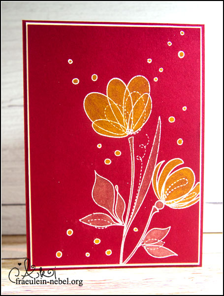
Es glitzert. Und schimmert. Die Elster in mir ist glücklich. Obwohl mir die Karte im Ganzen ein wenig zu bunt geraten ist – der Schimmer ist sowas von awesome. Leider auf einem Foto nur schlecht festzuhalten.

Karte "miss you so much" mit Simon Says Stamp und Ranger | fraeulein-nebel.org

So – geht eigentlich ganz einfach.
Die Blumen und Kreise wurden in Versamark Ink gestempelt, mit Embossingpulver überschüttet und per Heißluftföhn das Pulver geschmolzen. Übrigens, je heißer euer Föhn ist, desto weniger wölbt sich das Papier während dem Prozess, vorausgesetzt ihr föhnt nicht dauerhaft eine Stelle an. (Sollte man sowieso nicht, das Papier fängt durchaus auch mal an zu kokeln.)

Die Perfect Pearls-Puder sind wahnsinnig ergiebig. Mit der Nase vom Falzbein habe ich in einen Flaschendeckel ein kleines, wirklich winziges, Häufchen Pulver gegeben und mit einigen Tropfen Wasser vermischt. So entsteht eine sehr flüssige glitzernde Farbe, die ihr mit einem Pinsel wie normale Wasserfarbe aufbringen könnt. Diese Flaschendeckel eignen sich ganz gut, wenn man wie ich keine Mischpalette besitzt. Reinigt euren Pinsel gründlich, wenn ihr mit den Schimmerfarben fertig seid.
Die Pigmentpulver von Ranger haben eine Art Bindemittel mit drin; einmal in Kontakt mit Wasser lassen sie sich nicht mehr vom Papier abreiben. Find ich super – Glitzer und Schimmer ohne Abrieb und Saustall! :eek:
Vermischen lassen sich die gemischten Farben auch. Der Farbton „blue smoke“ war mir dem blauen Cardstock zu ähnlich, deshalb habe ich ein wenig von dem „perfect pearls“-Ton dazu gemischt.

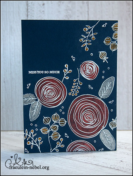
Das Blumen-Panel habe ich auf ein Stück Cardstock in marineblau geklebt und dieses Teil wiederum auf eine Base aus dem selben Papier. Im Innenteil klebt ein Stück Papier in vanille, damit Text reingeschrieben werden kann, ohne dass man groß auf die Stiftfarbe achten muss.

Fertig – ganz einfach, macht viel Spaß und die Ergebnisse sind wunderschön. Habt ihr Perfect Pearls schon benutzt? Meine lagen lange vergessen im Schrank rum.. jetzt bin ich doppelt froh, dass ich sie wiedergefunden habe. :D

___________________________________________

It’s glowing. And shiny. The magpie in me is a happy little bird. Although the card might be a bit too colourful for me in the end – I still like it. The shimmer is just awesome in real life, but hard to catch in photo.
By the way, you get the chance to see a mini-video on my instagram account – the shimmer and shine of this card is hard to catch on a photo.

It’s actually really easy to create a card like this one. You stamp your flowers and such in Versamark Ink and cover it with embossing powder. Grab your heat tool and melt the powder. Give your heatgun time to heat up sufficiently, it prevents the cardstock from warping. (You need to move the gun or else your paper might burn – you don’t want that.)

Perfect Pearl powders last a really long time. For this card I used a teeny-weeny amount of powder; I mixed it in some bottle caps with a few drops of water. Bottle caps are a great substitute for a colour palette. :)
If you mix your powder with water you get a liquid colour you can use like normal water colours. Paint them on your paper with a paint brush and make sure to clean your brush when you are done colouring. These Perfect Pearls come with some sort of a binder – once they are in contact with water they won’t rub off of your paper.
You can even combine these Perfect Pearls; the bluish colour got lost against the blue cardstock so I mixed in a bit of the pearlish colour.

I glued my flower-panel onto a piece of the same blue cardstock I used on my flower panel. I also glued a piece of vanilla cardstock on the inside so the sender can write the message properly.

Well, that’s it. Pretty easy, right? Did you ever use Ranger Perfect Pearls? I had mine for ages, lost in a drawer – I’m so happy that I found them again! :D

Material

Papier: SU! „marineblau“, „vanille pur“
Tinte & Farben: Versamark Ink, Ranger Perfect Pearls „perfect gold, „perfect pearls“, „rust“, „blue smoke“
Stempel: Simon Says Stamp „spring flowers“
Stanzen:
Sonstiges: Falzbein, Fiskars Schneidbrett, Pinsel, Wasserglas, Deckel von leeren Flaschen, dm Kleberoller „paradies“, Hero Arts Embossingpulver „white“, SU! Heißluftföhn

[Werkeltisch] #143 – feathers

Header Werkeltisch

please scroll down for english version :)

Uhm jah. Mal ’ne simple OneLayer-Karte. Ich wollte die Federn von The Alleyway Stamps nochmal benutzen, mir hat auf dieser Karte der Hintergrund so gut gefallen. Außerdem wollte ich schauen, ob ich ein regelmäßigeres Muster damit hinbekomme.

Karte "feathers" mit The Alleyway Stamps und Faber Castell | fraeulein-nebel.org

Mittendrin habe ich mir dann überlegt, dass ich keine Lust auf Knallfarben habe. Und bin eher bei den Erdtönen geblieben. Für einen Text konnte ich mich auch nicht entscheiden, also habe ich ihn weggelassen – alles in allem eine sehr „unentschlossene“ Karte. Ergebnis gefällt mir aber gut und ich könnte mir vorstellen, dass man das Teil sehr variabel einsetzen kann. :)
Zum Colorieren habe ich wieder die Aquarell-Buntstifte bemüht und mit einem Wassertankpinsel vermalt.
Das Muster ist tatsächlich ordentlicher geworden als bei der letzten Karte, trotzdem waren mir die Lücken noch zu groß. Im Stempelset gibt es aber – möglicherweise genau für diese Fälle! ;) – ein paar kleinere Elemente, die man als Füller nutzen kann. Schaut man in eure Sets, kleine Punkte, Herzchen, Sterne.. die kann man super verwenden bei sowas.

___________________________________________

Uhm yeah – this is a very simple one layer card. I wanted to re-use the feathers from The Alleyway Stamps because I liked this card’s background a lot. I also wanted to try to get a more even spacing between the feathers.
While working on the card, I decided that I did not feel like using bright colours again and instead used more earthy tones. I could not decide on a sentiment, so I did not use one at all. I still like the card and I can use it for different occasions since I’m not bound on a sentiment.
I used some aqaurell crayons to colour in the feathers. And because the spacing was still not good enough, I used some of the smaller elements in the stamp set to fill in the gaps. Check your sets, you can find lots of small stamps like hearts, dots or stars to balance your spacing.

Material

Papier: SU! „honiggelb“
Tinte & Farben: Versafine „onyx black“, schwarzer Permanentmarker, Faber Castell Aquarellstifte „ART GRIP AQUARELLE“
Stempel: The Alleyway Stamps „tickle me happy“
Stanzen:
Sonstiges: Falzbein, Fiskars Schneidbrett, Wassertankpinsel, MISTI