[Werkeltisch] #150 – GalaxyCard „Hallöchen“

Header Werkeltisch

please scroll down for english version :)

Erste GalaxyCard ever für mich! :D Der Held findet sie zu hell, ich mag den Hintergrund so wie er ist.
Sehr cool ist auch der Herstellungsprozess, weil das ganze am Anfang ganz schrecklich aussieht.. und am Ende wird eine hübsche Galaxie draus! :eek:

Karte "GalaxyCard Hallöchen" mit CreateASmile und Distress Ink | fraeulein-nebel.org

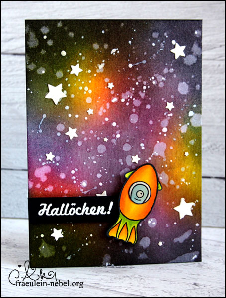
Glücklicherweise dauert es nicht wirlich lange, sich so ein Weltraumbild zu blenden. Farbe – in meinem Fall pink, gelb und lila – wahllos auf das Papier aufwischen, dann die Ränder abdunkeln und nach Geschmack weiter nach Innen blenden. Wichtig ist, dass die Ränder wirklich! dunkel werden, damit die farbigen Teile noch richtig schön knallen.
Sieht alles sehr chaotisch aus, bis dann die Sterne aufgebracht werden; wer mit Distress Ink geblendet hat, kann erstmal ein paar Spritzer Wasser auf dem Papier verteilen, das kurz einwirken lassen und abtupfen. Die Tinte reagiert mit dem Wasser und wird „aufgesaugt“, ihr erhaltet also helle Flecken. Eure ersten Sterne sind entstanden!
Für kleinere und hellere Sterne habe ich weiße Acrylfarbe mit etwas Wasser verdünnt und mit einem Pinsel aufgespritzt. Am Ende habe ich ein paar der Sterne nochmal nachgemalt, weil die Farbe zu sehr verdünnt war und mein Ergebnis statt strahlend-hell eher grau wurde.
Die Papiersterne sind ausgestanzt und extra aufgeklebt, mir war nach etwas Variation.

Meine Rakete ist eigentlich ein Tintenfisch-Stempel von Create A Smile; ich habe einfach das Gesicht nicht mitgestempelt und so eine Rakete draus gemacht. Ein Alien rein, mit Copics coloriert und fertig. Text ist ebenfalls von Create A Smile, weiß embosst auf schwarz und mit 3D-Foam aufgeklebt.

Fertig ist die GalaxyCard! Ich bin fast ein wenig traurig, dass ich in meinem Umfeld niemanden habe, der mit so einer Karte etwas anfangen könnte.. |D

___________________________________________

This is my first GalaxyCard ever. My boyfriend thinks it’s not dark enough. Too many bright colours.. but I like the way it turned out. It’s fun to create this kind of background; first it looks like a mess but it’s totally cool in the end! :eek:

Luckily it does not take long to create this background. You need some rather brigth colours – I used pink, yellow and a purple – blend them randomly on your paper, and use a dark colour to tone down the edges. You can blend the darker colours to the middle of your paper, too, if you feel like. Notice, it’s important! to really darken the edges so your other colours can pop!
Okay, created a hot mess? Time for the fun part. If you used Distress Inks, try splattering a few waterdroplets over your project. Let them sit for a few seconds and be happy about some nice light spots after you dabbed off the water. You created your first stars!
To get smaller and even lighter stars, use some acrylic paint and spritz it on your background; I diluted mine with a small amount of water to make it more runny, but had to repaint some of my stars later because the paint dried rather greyish.
I die cutted some paper stars with my bigshot and glued the pieces into place to add some more variation.

Yay, finished the first GalaxyCard! I’m somewhat sad though – can’t use this card I like so much, because no one around here would like it. |D

Material

Papier: SU! „vanille pur“, Aquarellpapier, schwarzer Tonkarton
Tinte & Farben: Memento „tuxedo black“, Memento Dual Marker „tuxedo black“, Ranger Distress Ink „picked rasberry“, „black soot“, „faded jeans“, „seedless preserves“, „mustard seed“, Versamark Ink, weiße Acrylfarbe
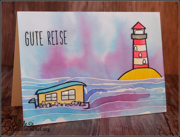
Stempel: Create A Smile „glowing seaside“, lawn fawn „monster mash“
Stanzen: Paper Smooches „stars“, mama elephant „confetti“
Sonstiges: Falzbein, Fiskars Schneidbrett, dm Kleberoller „paradies“, BigShot, Tombow Mono/Multi Glue, EK Success Tweezers, Ranger Glossy Accents, Cuttermesser, Pinsel & Wasserglas, Papierschere, SU! Stampin‘ Dimensionals

[Werkeltisch] #149 – Gute Reise mit Create A Smile

Header Werkeltisch

please scroll down for english version :)

Der Hintergrund lag für Wochen auf meinem Tisch. Kennt man, gelle? Man werkelt was, findet es toll und weiß am Ende trotzdem nicht, was man damit machen soll.
Kay, vor ein paar Tagen dann kam meine neuste Order von CreateASmile an – unter anderem mit dem tollen Set „glowing seaside“. Das wollte ich unbedingt mit irgendwas verwenden und hatte diverse Stücke Papier in der Hand.. und irgendwann auch diesen Hintergrund.
Bisher habe ich diese Hintergründe immer nach dem gleichen Muster gemacht und immer hochkant verwendet. Mehr aus Versehen (viele Versehen in letzter Zeit!) habe ich ihn dann mal seitlich gehalten – und tadaa! Sieht ja aus wie Wasser! Ein Meer! Glowing Seaside! Her mit der Tinte!

Karte "Gute Reise" mit CreateASmile und Distress Ink | fraeulein-nebel.org

Schiff und Leuchtturm sind auf Aquarellpapier gestempelt und mit Distress Ink coloriert. Der sandige Hügel ist freestyle entstanden; Distress Ink gewischt und mit einem schwarzen Marker eine Stempellinie geschummelt.
Eine Kurzanleitung für die Hintergrundgestaltung gibt es bei Debby Hughes – ist ganz einfach, ihr braucht eigentlich nur Masking Fluid und Farben dazu.

An zwei Stellen habe ich den Hintergrund eingeschnitten, damit ich die Stempelteilchen „in den Hintergrund“ bringen konnte.
Der Text ist auf Pergamentpapier embosst und direkt auf die Karte geklebt worden – fertig.

___________________________________________

I had this background on my craft table for a few weeks now. You might know that feeling; you create something you like but you end up not knowing how to go on with it.
I wanted to use it on a top folding card, but turned my paper in the wrong direction – and whoops, look at this! Looks like water. Like the sea, maybe. Lucky me, because I received my order from CreateASmile a few days ago, together with the stamp set „glowing seaside“. So I had to combine it with the cute ship and light house from that set!

I stamped my images on watercolour paper and coloured them with Distress Ink. For the hill, I blended some colour on the same paper and cut the shape as needed. I faked the black stamp line by using a black marker. ;)
If you need advice on how to create the background, I highly recommend checking this blogpost by Debby Hughes – it’s really ease, you only need masking fluid and some colours.

I cut a slit in my background to slide my stamped images in place; the sentiment is stamped on vellum in black ink and heat embossed.
That’s it! Cute and simple card done.

Material

Papier: SU! „vanille pur“, Aquarellpapier, Vellum/Pergamentpapier
Tinte & Farben: Memento „tuxedo black“, VersaMark Ink, Ranger Distress Ink
Stempel: Create A Smile „glowing seaside“
Stanzen: lawn fawn „stitched journaling card“
Sonstiges: Falzbein, Fiskars Schneidbrett, dm Kleberoller „paradies“, Ranger Multi Medium „matt“, EK Success Tweezers, Ranger Glossy Accents, Cuttermesser, Wasserglas & Pinsel, Papierschere

[Werkeltisch] #148 – graue Bäume mit PurpleOnionDesigns

Header Werkeltisch

please scroll down for english version :)

Ehm jah. Ich weiß gerade nicht genau, was ich über die Karte sagen soll. Weil kein Text draufsteht, könnte man sie theoretisch vielseitig einsetzen. Praktisch sieht sie für mich aus wie eine Trauerkarte – weil wegen Farben, Bäumen und nochmal Farben. War nicht so geplant, ich habe nämlich Schwierigkeiten mit Trauerkarten, noch mehr als mit Hochzeitskarten.
Aber tjanun, anscheinend habe ich ungewollt eine Trauerkarte gewerkelt.

Karte "graue Bäume" mit PurpleOnionDesigns und Copic Marker | fraeulein-nebel.org

Die Bäumchen kommen aus dem Hause PurpleOnionDesigns, die haben nur RubberStamps – also Gummistempel. Nur den Gummiteil, um den Schaumstoffteil muss man sich selbst kümmern. Ist nicht weiter tragisch, und das Montieren der Stempel macht sogar Spaß. :D Den Hersteller kannte ich schon länger, die Motive waren mir bisher aber zu „süßlich“. Aber die Bäumchen und Blümchen.. genau mein Ding.

So. Bäume gestempelt, mit Copics coloriert und den Grasboden nochmal nachgestempelt. Zum Stempeln mit Gummistempeln nutze ich übrigens gerne einen klassischen Stempelpositionierer, ansonsten werden meine Abdrücke grundsätzlich schief.
Das fertig colorierte Panel habe ich auf eine graue Base geklebt und als Dekogedöhns noch ein paar Pailletten aufgeklebt. Und weil ich dafür mein Glossy Accents eh draußen hatte, habe ich grad noch ein paar Punkte dazu getropft.
___________________________________________

I don’t really know what to tell you about this card. You could use it for anything, really, since there is no sentiment stamped on it. But because of the colours and the trees it looks like a sympathy card. Well, that was not planned – I tend to struggle creating sympathy cards, even more than wedding cards. But it seems that I created one by accident.

The trees are from PurpleOnionDesigns, a stamp company selling rubber stamps only. And by rubber stamps I mean the rubber part; you need to buy the foam to mount it on. It was kinda fun to mount the stamps, by the way. :) I’ve heard of that company long time ago but never liked their images. They looked way to cute and childlike to me; but I really like their new collections of flowers and trees.

I stamped the trees in copic friendly ink and coloured them with copic markers. I like to use a classic stamp positioner for stamping with rubber stamps – else my images turn out all crooked. :twisted:
The stamped panel is mounted on a base of plain grey cardstock. To add a bit more detail I glued on some sequins. I also added some tiny dots of Glossy Accents to go with the sequins.

Material

Papier: SU! >“schiefergrau“, „vanille pur“
Tinte & Farben: Memento „tuxedo black“, Copic Marker CIAO
Stempel: Stacey Yacula Studio für PurpleOnionDesigns „garden trees“
Stanzen:
Sonstiges: Falzbein, Fiskars Schneidbrett, dm Kleberoller „paradies“, Pailletten, Ranger Multi Medium „matt“, EK Success Tweezers, Ranger Glossy Accents, SU! stamp-a-majig