[Werkeltisch] #144 – Blauhexe

Header Werkeltisch

please scroll down for english version :)

Es kommt nicht oft vor, dass der Held sich bei mir eine Karte ordert. Aber vor ein paar Wochen war es der Fall – für eine Bekannte in den USA hat er sich eine Karte gewünscht und es sollte eine halbwegs halloween-artige Karte werden. Die Empfängerin steht nämlich, wenn man ihm glauben darf, total auf dieses Fest.
Gesagt, getan – mehr oder weniger, ich habe fleißig prokrastiniert – da ist die Karte.

Karte "Blauhexe" mit Ranger und MFT | fraeulein-nebel.org

Ihr seht, ich habe mich an dieser Karte vom letzten Jahr orientiert, die gefiel nämlich der Empfängerin sehr gut.
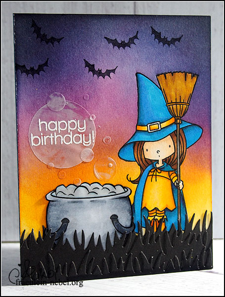
Eigentlich wollte der Held auch einen knorrigen Baum im Hintergrund haben, den konnte ich aber leider nicht mehr unterbringen, weil Frau Hexe an die falsche Stelle gestempelt wurde. *lol* Aus der Nut mach‘ eine Tugend: die Blauhexe bekam einen Hexenkessel, der auch gleich die Geburtstagsgrüße dampft.
Der Hintergrund wurde mit Distress Ink gewischt, die Hexe selbst und der Kessel mit Copics coloriert. Da ich noch immer keine passenden Lilatöne für das „Hexen-Lila“ habe, wurde sie kurzerhand blau/gelb gekleidet. Der Schwarm Fledermäuse wurde nachträglich vom Helden selbst gestempelt – ich krieg‘ ihn schon noch dazu, hihi! ;)

Die Blasen über dem Kessel sind aus Vellum gestanzt und mit Multi-Medium aufgeklebt. Ich wollte einen möglichst transparenten Kleber, da funktioniert der ganz gut. Auf der Karte sieht man bei einigen Blasen verwischte Fingerabdrücke und das sieht riiichtig cool aus. So scheinen manche richtig transparent und andere scheinen eine Spiegelung zu haben. :D

Ich hoffe, die Karte gefällt nicht nur uns, sondern auch euch – und vorallem der Empfängerin. Bisher kam sie leider noch nicht an.. :/

___________________________________________

It rarely happens that my boyfriend wants me to make a card for him. But it happend – he wanted a birthday card with a halloween-theme for a friend in the USA. As far as I know, she really likes this holiday.
So, here is the card! I finished it two days before he had to send it – procrastinating, yaaay!

As you can see, my idea came from a card I made last year, because I knew that the recipient liked it.
My boyfriend wanted me to also stamp the gnarly tree in the background but.. well yeah, I stamped the witch in the wrong spot and it looked so weird while rearranging my layout! So no tree, but a cauldron for my witch.
I blended my background with Distress Ink and coloured the witch and cauldron with CopicMarkers. I still don’t own the perfect „witchy purple“ colour so I decided to dress her in blue and yellow. My boyfriend himself stamped the bats in the background for a more halloweeny feeling. (I might get him to stamp a whole card, who knows.. ;) )

The bubbles were die cut from vellum and glued in place with multi medium from Ranger. It’s perfect for this job because it dries matte. If you look closely (in real life) you can see some smeared fingerprints. I really like the effect because some bubbles are perfectyl transparent and some show a kind of reflection. :D

I hope you all like the card as much as I do – and I hope my recipient likes it too. Seems like the card did not arrive yet.. :/

Material

Papier: SU! „marineblau“, „vanille pur“, Vellum/Pergamentpapier
Tinte & Farben: MFT „black licorice hybrid ink“, Copic Marker CIAO, Ranger Distress Ink “seedless preserves”, “wild honey”, “chipped sapphire”, “black soot”, Memento Dual Marker „tuxedo black“, Versamark Ink
Stempel: MFT “Witch Way Is the Candy?”, PennyBlack “Pumpkin Tree”, SSS „cupcake party“, Digistamp Opal Manor „cauldron“
Stanzen: SSS „luminary circles“, lawn fawn „grassy border“
Sonstiges: Falzbein, Fiskars Schneidbrett, BigShot, Papierschere, MISTI, dm Paradies Kleberoller, SU! Stampin’ Dimensionals, Ranger Mini-InkBlending Tool, Hero Arts Embossingpulver „white“, Embossingbuddy, Ranger Multi-Medium Matte

[Werkeltisch] #143 – feathers

Header Werkeltisch

please scroll down for english version :)

Uhm jah. Mal ’ne simple OneLayer-Karte. Ich wollte die Federn von The Alleyway Stamps nochmal benutzen, mir hat auf dieser Karte der Hintergrund so gut gefallen. Außerdem wollte ich schauen, ob ich ein regelmäßigeres Muster damit hinbekomme.

Karte "feathers" mit The Alleyway Stamps und Faber Castell | fraeulein-nebel.org

Mittendrin habe ich mir dann überlegt, dass ich keine Lust auf Knallfarben habe. Und bin eher bei den Erdtönen geblieben. Für einen Text konnte ich mich auch nicht entscheiden, also habe ich ihn weggelassen – alles in allem eine sehr „unentschlossene“ Karte. Ergebnis gefällt mir aber gut und ich könnte mir vorstellen, dass man das Teil sehr variabel einsetzen kann. :)
Zum Colorieren habe ich wieder die Aquarell-Buntstifte bemüht und mit einem Wassertankpinsel vermalt.
Das Muster ist tatsächlich ordentlicher geworden als bei der letzten Karte, trotzdem waren mir die Lücken noch zu groß. Im Stempelset gibt es aber – möglicherweise genau für diese Fälle! ;) – ein paar kleinere Elemente, die man als Füller nutzen kann. Schaut man in eure Sets, kleine Punkte, Herzchen, Sterne.. die kann man super verwenden bei sowas.

___________________________________________

Uhm yeah – this is a very simple one layer card. I wanted to re-use the feathers from The Alleyway Stamps because I liked this card’s background a lot. I also wanted to try to get a more even spacing between the feathers.
While working on the card, I decided that I did not feel like using bright colours again and instead used more earthy tones. I could not decide on a sentiment, so I did not use one at all. I still like the card and I can use it for different occasions since I’m not bound on a sentiment.
I used some aqaurell crayons to colour in the feathers. And because the spacing was still not good enough, I used some of the smaller elements in the stamp set to fill in the gaps. Check your sets, you can find lots of small stamps like hearts, dots or stars to balance your spacing.

Material

Papier: SU! „honiggelb“
Tinte & Farben: Versafine „onyx black“, schwarzer Permanentmarker, Faber Castell Aquarellstifte „ART GRIP AQUARELLE“
Stempel: The Alleyway Stamps „tickle me happy“
Stanzen:
Sonstiges: Falzbein, Fiskars Schneidbrett, Wassertankpinsel, MISTI

[Werkeltisch] #142 – „hello“ mit Rosen

Header Werkeltisch

please scroll down for english version :)
Oh my, mal eine Karte, die ich richtig richtig riiiichtig gerne mag. :eek: Und ich bin eine Faulette und schreibe ewig keinen Post dazu. Nuja.
Die Rosen lagen schon etwas länger bei mir rum – die wollte ich nämlich ursprünglich auf der Karte für meine Mutter verwenden. Aber.. naja, wollte irgendwie nicht, weil mir DIESE Idee gefehlt hat.

Karte "

Erstmal Gold auf die weiße Base spritzen. GEBT MIR GOLD! Ich bin ganz furchtbar, die Ulli hat mich voll angesteckt mit ihrer Goldsucht.
Dafür habe ich ein Sprühfläschchen mit goldenem Schimmer genommen, Pinsel rein und losgetropft. Liebe. :eek:

Die Rosen stammen aus dem Hause „Simon Says Stamp“, aus einem älteren Set. Sie wurden auf Aquarellpapier gestempelt, weiß embosst und dann mit Distress Ink gefärbt. Pro Tipp dabei: Falls ihr Farbe auf den embossten Teil bekommt, keine Panik. Das kann man erfahrungsgemäß einfach mit einem Tuch abreiben, wenn die Chose getrocknet ist. Die Blätter sind genauso gemacht.
Damit die Blümchen nicht so flach wirken, habe ich die verschiedenen Ebenen auseinander geschnitten; bei Ebene 1 und 2 ging das noch easy mit der Schere, für den fuppeligen Teil in der Mitte musste ein Skalpell herhalten. Mit Abstandsklebepads habe ich die Rosen wieder zusammengesetzt – tadaa! Als krönenden Abschluss hat die Elster in mir die fertigen Teile noch mit einem „Wink of Stella“ in transparent zum glimmern gebracht. :D
Arrangieren, kleben, fertig.

Der Textstempel ist von Altenew und wurde insgesamt dreimal mit dem MISTI gestempelt. Irgendwie hatte ich ’nen Lauf und war nicht fähig, meinen Stempel ordentlich zu färben – dafür liebe ich mein MISTI. Einfach nochmal eintinten und auf die selbe Stelle stempeln.. und plötzlich ist der versaute Schriftzug perfekt.
Einen weißen Rand als Accent drumrum habe ich stehen lassen, Goldfaden drunter.. auch fertig. Den Goldfaden wickel ich mir übrigens um zwei Finger, damit ich halbwegs ordentliche Schlaufen zum Arbeiten habe.

Noch nich genug Gold! Und das schwarz im Textteil so alleine!
Die Vorderseite meiner Karte habe ich kurzentschlossen ein wenig schmaler geschnitten. Im Innenteil habe ich dann einen Streifen schwarz/weißes Papier aufgeklebt, ebenso wie einen Streifen Goldpapier. :eek: Wenn die Karte jetzt geschlossen vor einem liegt, sieht es aus, als wäre der Dekoteil außen; man öffnet die Karte und hat einen kurzen Aha-Moment, weil.. ist eben nicht so. ;) Schlägt zwei Fliegen mit einer Klappe, den Innenteil meiner Karten vernachlässige ich sträflich.

___________________________________________

This is one of the few cards I really like. Like very much. And it took me ages to write the blog post – buh!
The roses were lying on my desk for quite some time now; originally I wanted to use them on a card I made for my mother.

First things first – I wanted some gold on my white cardbase. I took a bottle of shimmer spritz, dipped my brush in it and started dotting colour. I just love the gold. :eek: (That’s my friend Ulli’s fault – she’s so much into gold.)

The roses come from an older stamp set from Simon Says Stamp. I stamped them on aquarell paper, heat embossed flowers and leaves in white and added colour with Distress Inks. By the way – if you get Distress Ink on the white embossed parts, don’t panic. Usually you can just wipe the colour off with a dry cloth after the ink has dried.
To get more dimension onto my card I cut apart the different flower layers. That was easy for the first and second layer but I had to use a scalpel to cut the tiny last layer. 3D foam brought the whole flower back together – and now look at the dimension! :D To finish things off I added some clear „Wink of Stella“ glitter pen. Arranging the cluster, glueing it in place – done.

For my sentiment I used a stamp from Altenew and I kinda had bad luck with it. I had to ink it up three times to get a good impression. Good thing I own a MISTI stamping tool! I just stamped a few times in the same spot and suddenly my messed up piece looked really good. Yay for MISTI! :D
I left a thin white border around my sentiment and added some gold thread under it.

MORE GOLD PLS! And the poor black sentiment was the only black thing in the whole card – I did not like that at all.
I added some b/w stripped paper and some gold foiled paper on the inside of my card; I just cut away a piece of the front to make it more narrow. This killed two birds with one stone – I added some interest to balance the card and I decorated the inside of my card. I tend to forget the insides and just write my messages there – but it’s so cool to open up a card and find the inside matching the front. :)

Material

Papier: Papertrey Ink „white“, Aquarellpapier, Druckerpapier
Tinte & Farben: Hero Arts Metallic Shimmer „gold“, Ranger Distress Ink „picked rasberry“, „abandoned coral“, „festive berries“, „evergreen bough“, „cracked pistachio“, „black soot“, Versamark Ink, Versafine „onyx black“, Toner (Laserdrucker), Wink of Stella „clear“
Stempel: Altenew „label love“, SSS „best mom ever“
Stanzen:
Sonstiges: Falzbein, Fiskars Schneidbrett, Papierschere, HeroArts Embossingpulver „white“, SSS Stencil „diagonal stripe“, ThermOWeb Decofolie “gold”, Laserdrucker, Laminiergerät, Pinsel & Wasserglas, dm Paradies Kleberoller, Mini Gluedots, Goldfaden, MISTI