[Werkeltisch] #142 – „hello“ mit Rosen

Header Werkeltisch

please scroll down for english version :)
Oh my, mal eine Karte, die ich richtig richtig riiiichtig gerne mag. :eek: Und ich bin eine Faulette und schreibe ewig keinen Post dazu. Nuja.
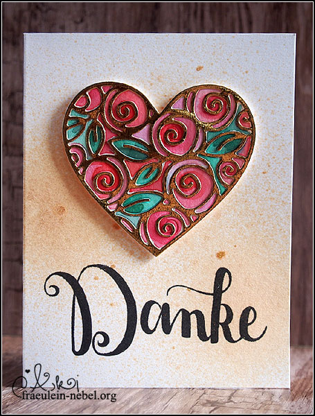
Die Rosen lagen schon etwas länger bei mir rum – die wollte ich nämlich ursprünglich auf der Karte für meine Mutter verwenden. Aber.. naja, wollte irgendwie nicht, weil mir DIESE Idee gefehlt hat.

Karte "

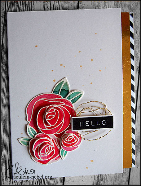
Erstmal Gold auf die weiße Base spritzen. GEBT MIR GOLD! Ich bin ganz furchtbar, die Ulli hat mich voll angesteckt mit ihrer Goldsucht.
Dafür habe ich ein Sprühfläschchen mit goldenem Schimmer genommen, Pinsel rein und losgetropft. Liebe. :eek:

Die Rosen stammen aus dem Hause „Simon Says Stamp“, aus einem älteren Set. Sie wurden auf Aquarellpapier gestempelt, weiß embosst und dann mit Distress Ink gefärbt. Pro Tipp dabei: Falls ihr Farbe auf den embossten Teil bekommt, keine Panik. Das kann man erfahrungsgemäß einfach mit einem Tuch abreiben, wenn die Chose getrocknet ist. Die Blätter sind genauso gemacht.
Damit die Blümchen nicht so flach wirken, habe ich die verschiedenen Ebenen auseinander geschnitten; bei Ebene 1 und 2 ging das noch easy mit der Schere, für den fuppeligen Teil in der Mitte musste ein Skalpell herhalten. Mit Abstandsklebepads habe ich die Rosen wieder zusammengesetzt – tadaa! Als krönenden Abschluss hat die Elster in mir die fertigen Teile noch mit einem „Wink of Stella“ in transparent zum glimmern gebracht. :D
Arrangieren, kleben, fertig.

Der Textstempel ist von Altenew und wurde insgesamt dreimal mit dem MISTI gestempelt. Irgendwie hatte ich ’nen Lauf und war nicht fähig, meinen Stempel ordentlich zu färben – dafür liebe ich mein MISTI. Einfach nochmal eintinten und auf die selbe Stelle stempeln.. und plötzlich ist der versaute Schriftzug perfekt.
Einen weißen Rand als Accent drumrum habe ich stehen lassen, Goldfaden drunter.. auch fertig. Den Goldfaden wickel ich mir übrigens um zwei Finger, damit ich halbwegs ordentliche Schlaufen zum Arbeiten habe.

Noch nich genug Gold! Und das schwarz im Textteil so alleine!
Die Vorderseite meiner Karte habe ich kurzentschlossen ein wenig schmaler geschnitten. Im Innenteil habe ich dann einen Streifen schwarz/weißes Papier aufgeklebt, ebenso wie einen Streifen Goldpapier. :eek: Wenn die Karte jetzt geschlossen vor einem liegt, sieht es aus, als wäre der Dekoteil außen; man öffnet die Karte und hat einen kurzen Aha-Moment, weil.. ist eben nicht so. ;) Schlägt zwei Fliegen mit einer Klappe, den Innenteil meiner Karten vernachlässige ich sträflich.

___________________________________________

This is one of the few cards I really like. Like very much. And it took me ages to write the blog post – buh!
The roses were lying on my desk for quite some time now; originally I wanted to use them on a card I made for my mother.

First things first – I wanted some gold on my white cardbase. I took a bottle of shimmer spritz, dipped my brush in it and started dotting colour. I just love the gold. :eek: (That’s my friend Ulli’s fault – she’s so much into gold.)

The roses come from an older stamp set from Simon Says Stamp. I stamped them on aquarell paper, heat embossed flowers and leaves in white and added colour with Distress Inks. By the way – if you get Distress Ink on the white embossed parts, don’t panic. Usually you can just wipe the colour off with a dry cloth after the ink has dried.
To get more dimension onto my card I cut apart the different flower layers. That was easy for the first and second layer but I had to use a scalpel to cut the tiny last layer. 3D foam brought the whole flower back together – and now look at the dimension! :D To finish things off I added some clear „Wink of Stella“ glitter pen. Arranging the cluster, glueing it in place – done.

For my sentiment I used a stamp from Altenew and I kinda had bad luck with it. I had to ink it up three times to get a good impression. Good thing I own a MISTI stamping tool! I just stamped a few times in the same spot and suddenly my messed up piece looked really good. Yay for MISTI! :D
I left a thin white border around my sentiment and added some gold thread under it.

MORE GOLD PLS! And the poor black sentiment was the only black thing in the whole card – I did not like that at all.
I added some b/w stripped paper and some gold foiled paper on the inside of my card; I just cut away a piece of the front to make it more narrow. This killed two birds with one stone – I added some interest to balance the card and I decorated the inside of my card. I tend to forget the insides and just write my messages there – but it’s so cool to open up a card and find the inside matching the front. :)

Material

Papier: Papertrey Ink „white“, Aquarellpapier, Druckerpapier
Tinte & Farben: Hero Arts Metallic Shimmer „gold“, Ranger Distress Ink „picked rasberry“, „abandoned coral“, „festive berries“, „evergreen bough“, „cracked pistachio“, „black soot“, Versamark Ink, Versafine „onyx black“, Toner (Laserdrucker), Wink of Stella „clear“
Stempel: Altenew „label love“, SSS „best mom ever“
Stanzen:
Sonstiges: Falzbein, Fiskars Schneidbrett, Papierschere, HeroArts Embossingpulver „white“, SSS Stencil „diagonal stripe“, ThermOWeb Decofolie “gold”, Laserdrucker, Laminiergerät, Pinsel & Wasserglas, dm Paradies Kleberoller, Mini Gluedots, Goldfaden, MISTI

[Werkeltisch] #139 – rosiges Danke

Header Werkeltisch

please scroll down for an english version :)

Mein Vater hat eine Karte geordert. „Eine besondere, ausgefallene, datt dollste waste je gemacht hast. Mach mal. Wird schon.“
Für meine Mutter, zu einem besonderen Hochzeitstag.
Mhm. Ja, es wurde. Aber im Nachhinein, gerade wenn ich mir das Foto nochmal ansehe, ist es definitiv nicht das dollste beste was ich je gemacht habe. Ich würde viel anders machen, wenn die Karte nochmal zu machen wäre. :eww:

Karte “Danke” mit SSS und CreateASmile | fraeulein-nebel.org

Die Base habe ich mit goldenem Schimmerspray eingenebelt, gibt einen schönen Effekt.
Der Text wurde gewünscht, „Danke“ und bitte in deutsch. Gestempelt wurde über das Goldspray, deshalb glitzert der Schriftzug mit dem Herz.. naja, nicht um die Wette, aber er glitzert. Zum Stempeln habe ich – Gott sei Dank! – mein MISTI benutzt, der erste Abdruck war alles andere als schön. Mit dem MISTI konnte ich einfach nochmal auf die selbe Stelle stempeln und das Problem war gelöst!

Das Herz wurde zweimal mit der BigShot gestanzt, einmal aus Aquarellpapier und ein zweites Mal aus gold-foliertem Druckerpapier. Das Aquarellherz habe ich mit Distress Ink bearbeitet und das goldene einfach drüber geklebt. Das Herz ist übrigens nicht ganz gold, die Folie greift nicht überall auf dem Toner. Eventuell druckt unser Drucker ungleichmäßig, aber es sieht okay aus.
So, das fertige Teil wurde mit Abstandskleber aufgeklebt um dem ganzen mehr Tiefe zu geben.

Was würde ich anders machen. Speziell für dieses Projekt hätte ich mir ein paar neue deutsche Stempeln kaufen sollen, unter anderem ein dezenteres „Danke“. Die Proportionen hätte ich auch anders gewählt, Herz mehr in die Mitte und dann ein kleinerer Text versetzt dazu, eventuell auf Höhe der Herzspitze?
Mal sehen, vielleicht baue ich das Teil nochmal nach. Einiges gelernt habe ich beim Werkeln und Folieren, das ist doch mal was. Und gefallen hat die Karte am Ende auch. :oops:
___________________________________________

My dad ordered a card. „A special one, extravagant, the best one you’ve ever made. Just do it, I know it will be fine.“
It is for my mother, for a special wedding anniversary.
Well. So I created a card. In retrospect, while looking at the photo, I realise that it’s definitly NOT the best one I’ve ever made. I would change a lot if I had to re-do the card. :eew:

I coated the base with some golden shimmer spray. Then I stamped the black sentiment over that, that’s why it’s shimmering as well. Not as much as the heart, but it serves it purpose.
Good thing I used my MISTI to stamp the sentiment! The first try did not turn out nice but with the MISTI I was able to just stamp again, right on top – problem solved!

The heart die went through the BigShot twice – one time with watercolour paper, the second time with gold-foiled printer paper. I coloured the watercolour paper heart with some Distress Inks and glued the gold one in place. The surface of the golden heart is not completely covered with gold foil – I guess our printer did an irregular job there – but it looks just fine.
I taped the heart in place with some 3D foam to give it some dimension.

So, what would I do differently?
First of all, I should have bought some new german sentiments, including a more discreet „Danke“-stamp (translate „thank you“). I would change the proportions as well – maybe tape the heart more to the center and add a small sentiment next to it.
I might eventually rebuild this card, we’ll see about that. I learned quite a lot in the process (especially foiling) though, so that’s a good thing. And my parents liked the card after all – that’s whats important. :oops:

Material

Papier: Papertrey Ink CS „white“, Aquarellpapier, Druckerpapier
Tinte & Farben: Versafine „onyx black“, Hero Arts Metallic Shimmer „gold“, Ranger Distress Ink „picked rasberry“, „abandoned coral“, „festive berries“, „evergreen bough“, „cracked pistachio“
Stempel: Create A Smile „ein riesiges Danke“
Stanzen: SSS „heart of roses“
Sonstiges: Falzbein, Fiskars Schneidbrett, BigShot, BigShot MetalShim, Papierschere, ThermOWeb Decofolie „gold“, Laserdrucker, Laminiergerät, Pinsel & Wasserglas, Tombow Mono-Multi Glue, SSS 3D Foam

[Werkeltisch] #138 – alles wird gut

Header Werkeltisch

please scroll down for english version :)

Der liebste Lieblingschef verlässt die Praxis. Da musste eine Karte her, wo man ’n bisschen auf die Tränendrüse drücken darf und mal „offiziell“ und nicht nur nebenher ein Dankeschön ausspricht. Er ist ein echt guter Kerl und mit ihm arbeiten macht riesig Spaß. Ganz viel Geduld hat der Mann, erklärt und zeigt viel, fordert aber auch, dass man was weiß und sich anstrengt. Oh, und sein Humor, genau mein Ding.
Ich werd ihn vermissen. :eek:

So. Tränendrüse genug gedrückt, zurück zur Karte.
Sechs Anläufe, bis ich ungefähr wusste, was ich überhaupt machen will. Dann nochmal zwei bis zur finalen Karte, weil mir mal die Farben und mal der Aufbau nicht gefallen haben. Und als die Idee dann endlich stand, ging’s ganz einfach.

Die Dreiecke sind in weiß embosst, dann Distress Ink auf Aquarellpapier, als „nass in nass“-Technik. Insgesamt sind es drei Schichten Farbe, plus ein paar Pinselspritzer als kleine Details.
Das Text-Teilchen habe ich am Computer geschrieben und dann in weiß auf schwarzem Grund gedruckt, weil ich’s folieren.. foilen.. mit Folie.. dingsen wollte, ihr wisst schon. Diese Thermofolie, die mit dem Drucker-Toner verschmilzt und schick glänzt. Auf beide Seiten vom Aquarellpanel habe ich zwei schmale Streifen Goldfolie aufgebracht, damit nicht das Textfeld alleine raussticht.

Karte “"alles wird gut" mit SSS und Ranger | fraeulein-nebel.org

Der Text auf der Karte ist übrigens der Spruch vom liebsten Lieblingschef, wenn irgendwas nicht direkt so läuft, wie es eben soll. Ich wünsch‘ ihm alles Gute. Alles wird gut. :eek:

___________________________________________

The best boss ever has left my work place today. We, the team, decided to not just give him a farewell present, but to present it in a nice card. We wanted to thank him in an „official“ way, not just the quick „thank you“ he’d get while working alongside him. He’s a good guy and it’s fun to work with him. He’s very patient and really good at explaining and showing you stuff so you can do it alone next time. But he also challenges you to do your best and go for more. Oh, and his humour is awesome.
I will miss him. :eek:

Okay. Enough playing on your heart strings, back to the card!
I tried six times to create something. Two more tries before I came up with the final card design – the first time around I didn’t like the colour scheme, then I ended up not liking the whole design. But eventually a fitting idea came to mind and everything was fine.

I heat embossed the triangles with white emossing powder and painted some Distress Ink on some watercolor paper. If you look closely you can see three layers of ink, and a few ink splashes for some detail.
I printed the sentiment with my laser printer – I wanted to use some gold foil to make it ultra shiny. I also added some thin strips of foiled paper to each of the sides so there would be more gold on the whole project.

The sentiment means „everything will be fine“ and the best boss ever used to say that when things went wrong at first but he knew it would work out in the end. I wish him all the best. Everything will be fine. :eek:

Material

Papier: Neenah „solar white“, Aquarellpapier, Druckerpapier
Tinte & Farben: Versamark Ink, Toner vom Drucker, Ranger Distress Ink „mermaid lagoon“, „peacock feathers“, „salty ocean“
Stempel: SSS „perfect shapes“
Stanzen:
Sonstiges: Falzbein, Fiskars Schneidbrett, Hero Arts Embossingpulver „white“, SU! Heißluftföhn, Papierschere, Embossing Buddy, ThermOWeb Decofolie „gold“, Laserdrucker, Laminiergerät, Pinsel & Wasserglas, Moosgummi, doppelseitiges Klebeband